Your banner and your profile photo sit inches apart on screen and are processed as one visual unit, yet most professionals leave the banner on the default blue gradient LinkedIn fills in automatically. Below are the exact specs for 2026, the safe zone that keeps critical content from being cropped, six proven layout ideas compared, four free downloadable templates, and a decision guide to match the right approach to your goal.
Correct LinkedIn banner size for 2026
SPEC1584 × 396 px
Profile photo overlap area on desktop
SPEC~200 × 200 px
Free templates included in this guide
FREE4 templates
01 THE EXACT SPECS & SAFE ZONE
Get the dimensions right before you design anything
Almost every disappointing LinkedIn banner traces back to the same root cause: wrong dimensions, not a bad design idea.
1584×396
Personal profile banner size, px
4:1
Aspect ratio
8 MB
Max file size (PNG or JPG)
1128×191
Company Page size (different!)
200×200
Photo overlap zone, px
LinkedIn profile card · Teal box = safe zone · Red zones = mobile crop area · Photo overlaps banner bottom-left
The profile photo overlap and the safe zone are two separate hazards, not one. Your circular profile photo covers roughly the bottom-left 200 × 200 pixels on desktop, keep names, logos, and faces out of that corner entirely. Separately, LinkedIn's mobile app crops more aggressively from the left and right edges than desktop does, so the reliably visible area on every device is the centered box shown above, roughly 1128 pixels wide. Design inside that box and you're safe everywhere; design toward the edges and you're gambling on which device your visitor is using.
It's worth naming why this space gets skipped so often in the first place: LinkedIn doesn't prompt you to fill it the way it prompts you to add a headline or a photo, so it quietly stays on the default blue gradient unless someone deliberately decides to fix it. That default isn't broken, exactly, it's just neutral in a way that a real banner isn't, and neutral is a missed opportunity on the one part of your profile with almost no competition for attention.
02 SIX BANNER IDEAS, COMPARED
What to actually put in that space
Six approaches cover almost every professional context, pick based on what you most want a visitor to know in the first two seconds.
Idea
What it communicates
Best for
Tagline / value proposition
What you do, in one line
Almost anyone, the safest default
Skills & keyword strip
Specific, scannable expertise
Job seekers, recruiters searching by skill
Quote or mission statement
Values and personality
Coaches, speakers, personal brands
Certifications & credentials
Verified authority
Consultants, licensed professionals
Event or speaking photo
Social proof, real-world presence
Speakers, thought leaders, sales
Contact / CTA banner
How and why to reach you
Freelancers, consultants, founders
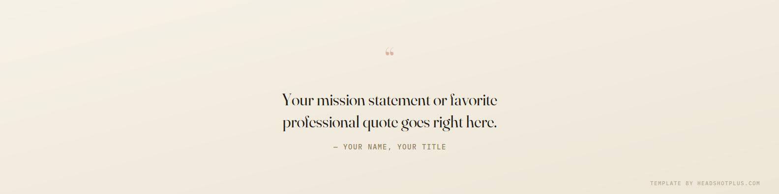
Two of these six are covered by the templates below, chosen because they're the two we see people struggle with most: putting a tagline into words that don't sound generic, and turning a skills list into something that reads as designed rather than pasted in. Certifications, event photos, and quote banners are usually easier to build once you have real assets to work from, so we've focused the templates where a blank page is the biggest barrier.
03 FOUR FREE TEMPLATES
Sized correctly, ready to customize
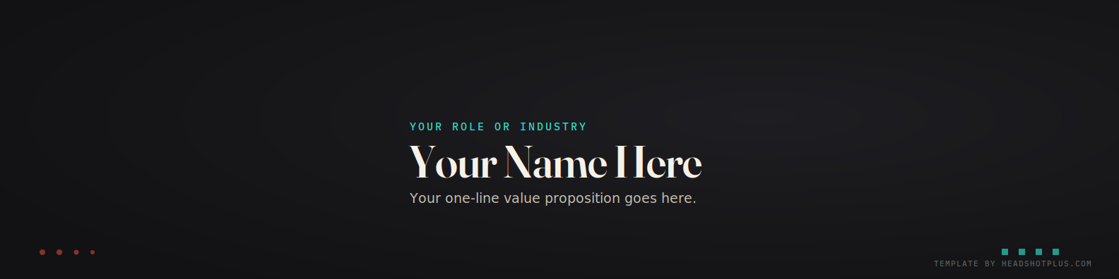
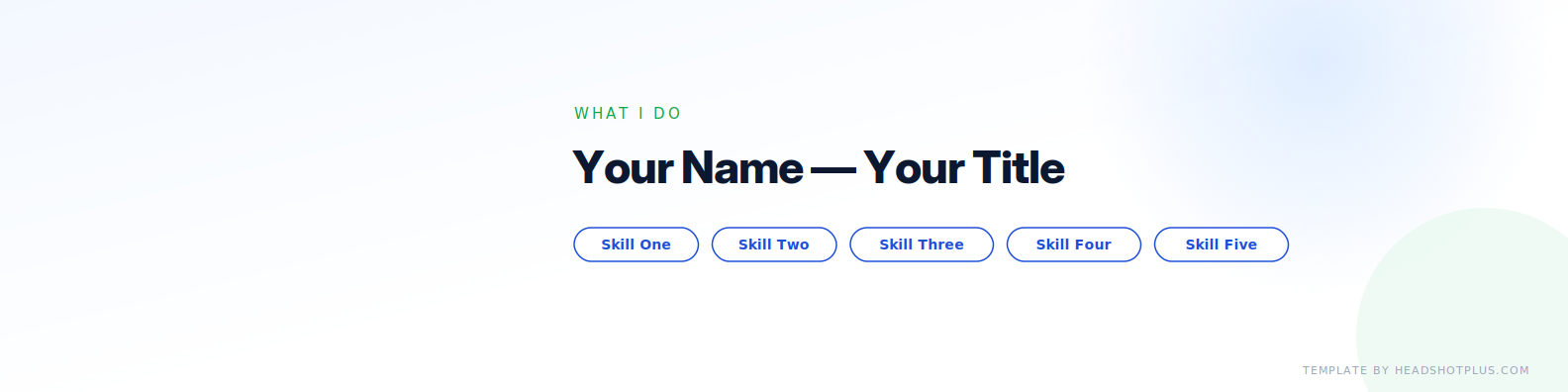
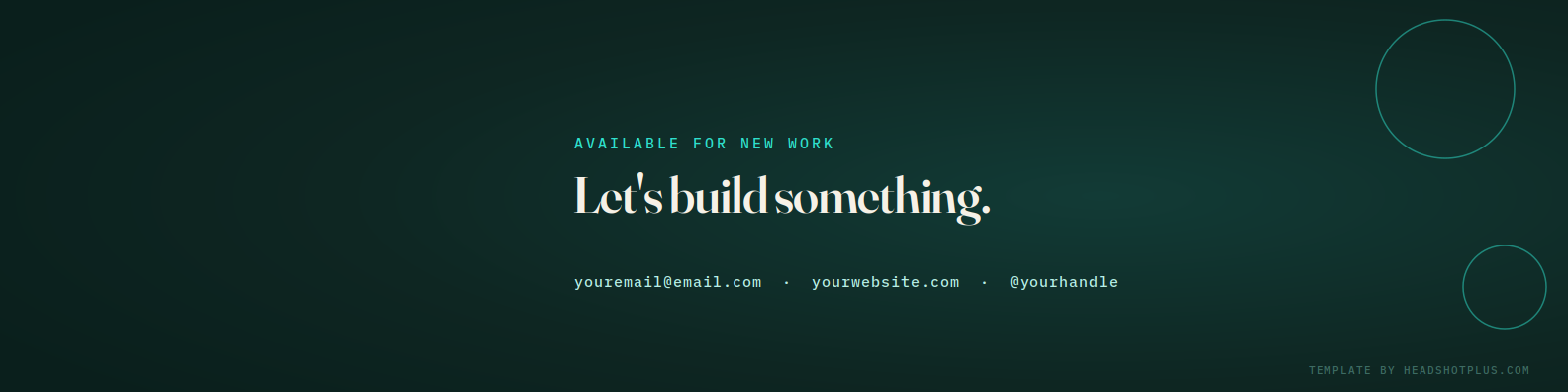
Each one is a real 1584 × 396px PNG, safe-zone tested, with a placeholder layout you can rebuild with your own text in Canva, Figma, or any editor in a few minutes. Right-click any image below to save it, swap the placeholder text for your own, and export at the same 1584 × 396px size before uploading to LinkedIn.
Name, role, and a single value-proposition line, the layout that works for the widest range of professions. Swap in your own name, role, and one sentence describing what you do differently.
A row of chips for your top 4–5 skills, the same exact-match keyword thinking that matters for your headline applied visually, so a recruiter scanning your profile sees your specialty in under a second.
An availability signal plus contact details laid out for scanning, not reading, useful for anyone actively looking for new clients or opportunities right now.
All four are free to use and edit. Each includes a small "Template by Headshot Plus" credit line in the corner, feel free to remove it once you've customized the design.
04 MISTAKES TO AVOID
What quietly undercuts an otherwise good banner
The pattern worth watching for
Text sized for a full-screen view often becomes unreadable at the small size a banner actually displays at, aim for a single headline at 48px or larger, high contrast against the background. A busy stock photo competes with your profile photo instead of supporting it; simpler, calmer backgrounds consistently read as more professional. Low-resolution or upscaled images go soft and blurry the moment LinkedIn compresses them, so start from a real 1584 × 396px file rather than stretching a smaller one. And the one people miss most: a banner whose color palette clashes with the tone of your profile photo creates a subtle "these don't belong together" impression, even when neither element is bad on its own.
That last point is worth sitting with. Your banner and your photo are the only two visual elements on your entire profile, and they sit inches apart on every screen. Treating them as one coordinated first impression, rather than two separate uploads, is the difference between a profile that looks designed and one that looks assembled.
05 WHICH IDEA FITS YOU
Match the banner to your goal
If you're…
Use this idea
Not sure where to start
Tagline / value proposition
Actively job hunting
Skills & keyword strip
Building a personal brand or coaching practice
Quote / mission banner
A licensed or certified professional
Certifications & credentials
A frequent speaker or conference presence
Event or speaking photo
Freelancing or actively taking on clients
Contact / CTA banner
Before You Upload
Image is exactly 1584 × 396px (or scaled proportionally from it)
All names, logos, and key text sit inside the centered safe zone
Bottom-left corner left clear for the profile photo overlap
Headline text is 48px or larger with strong contrast
File is PNG or JPG, under 8MB
Previewed on both desktop and mobile before publishing
Color palette feels like the same person as your profile photo
What is the correct LinkedIn banner size in 2026?
1584 × 396 pixels, a 4:1 aspect ratio, for personal profiles. Company Pages use a different size, 1128 × 191 pixels, the two are not interchangeable.
Where does my profile photo overlap the banner?
On desktop, your circular profile photo covers roughly the bottom-left 200 × 200 pixels of the banner. Keep names, logos, and important graphics out of that corner, and out of the far left and right edges, which crop more aggressively on mobile.
Should my banner and my profile photo match in style?
Yes, they sit inches apart on screen and get read as one visual unit. A polished banner behind a dated or poorly lit photo creates a mismatch that undercuts the professionalism either element was going for on its own.
Can I just leave the default LinkedIn banner?
You can, but it's one of the clearest signals of an under-maintained profile, since the large majority of professionals never replace it. A custom banner is a low-effort way to stand out simply because so few people bother.
What file size and format does LinkedIn accept for banners?
PNG or JPG, up to 8MB, at 1584 × 396 pixels. Uploading at a much higher resolution doesn't improve display quality on LinkedIn and only increases file size and compression risk.

'/%3E%3Crect width='1200' height='400' fill='url(%23b)'/%3E%3C/svg%3E)
